James Avenue Pumphouse
James Avenue Pumphouse is a new restaurant located in the heart of historic downtown Winnipeg. The goal was to create a brand identity that reflects the rich heritage of the area while appealing to a modern dining audience. The branding needed to feel authentic, memorable, and versatile across digital and physical touchpoints.
Role: Sr. Graphic Designer
Tools: Illustrator, Photoshop
Objective
Develop a cohesive brand identity and logo that:
-
Captures the essence of Winnipeg’s historic downtown.
-
Communicates sophistication and warmth for a dining experience.
-
Works seamlessly across signage, menus, social media, and merchandise.
Design Challenge
-
Balancing heritage and modernity: The design needed to honor the historic roots without feeling dated.
-
Ensuring scalability: The logo had to look great on large signage and small digital icons.
-
Creating a distinctive identity in a competitive restaurant market.
Research & Inspiration
-
Historic Elements: Studied architectural details and industrial motifs from Winnipeg’s downtown.
-
Color Palette: Drew inspiration from warm brick tones and metallic accents found in heritage buildings.
-
Typography: Explored typefaces that evoke strength and elegance, reflecting the restaurant’s character.
Design Process
-
Mood Boards: Compiled visual references to define tone and style.
-
Sketching & Iteration: Developed multiple logo concepts focusing on industrial and heritage cues.
-
Refinement: Selected a design featuring bold typography and a subtle emblem inspired by pump machinery.
-
Brand System: Extended the identity into color palette, typography guidelines, and usage rules.
Final Deliverables
-
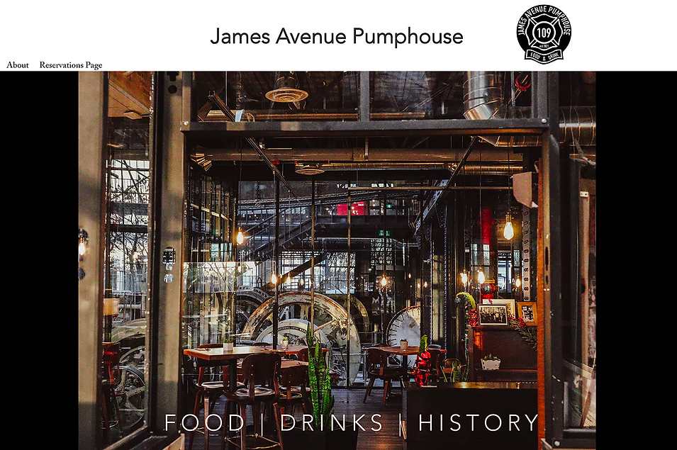
Logo: A strong wordmark paired with a minimal emblem symbolizing the pump mechanism, representing both history and movement.
-
Color Palette: Warm earth tones with deep charcoal for contrast.
-
Applications: Menus, signage, social media templates, restaurant decor and merchandise mock-ups.


Impact
-
Delivered a brand identity that resonates with the local community and visitors.
-
Created a versatile system that supports marketing and future expansion.
-
Positive feedback from stakeholders on the balance of heritage and modern appeal.
Takeaways
-
Context Matters: Understanding the cultural and historical backdrop enriched the design.
-
Versatility is Key: Designing for multiple touchpoints ensures brand consistency.
-
Storytelling Through Design: A strong narrative behind the logo makes the brand memorable.